Creative Session - Caldera Football Club
Branding
Branding
For this project, I was given a fictional sports team to research and brand. To kick things off, I explored sports brands, teams, and competitions — looking at what makes their identities stand out visually and emotionally. I collected this research into a moodboard that captures key themes, styles, and branding approaches that inspired me.
Using that as a foundation, I designed a logo for my team — something that feels distinctive and memorable.
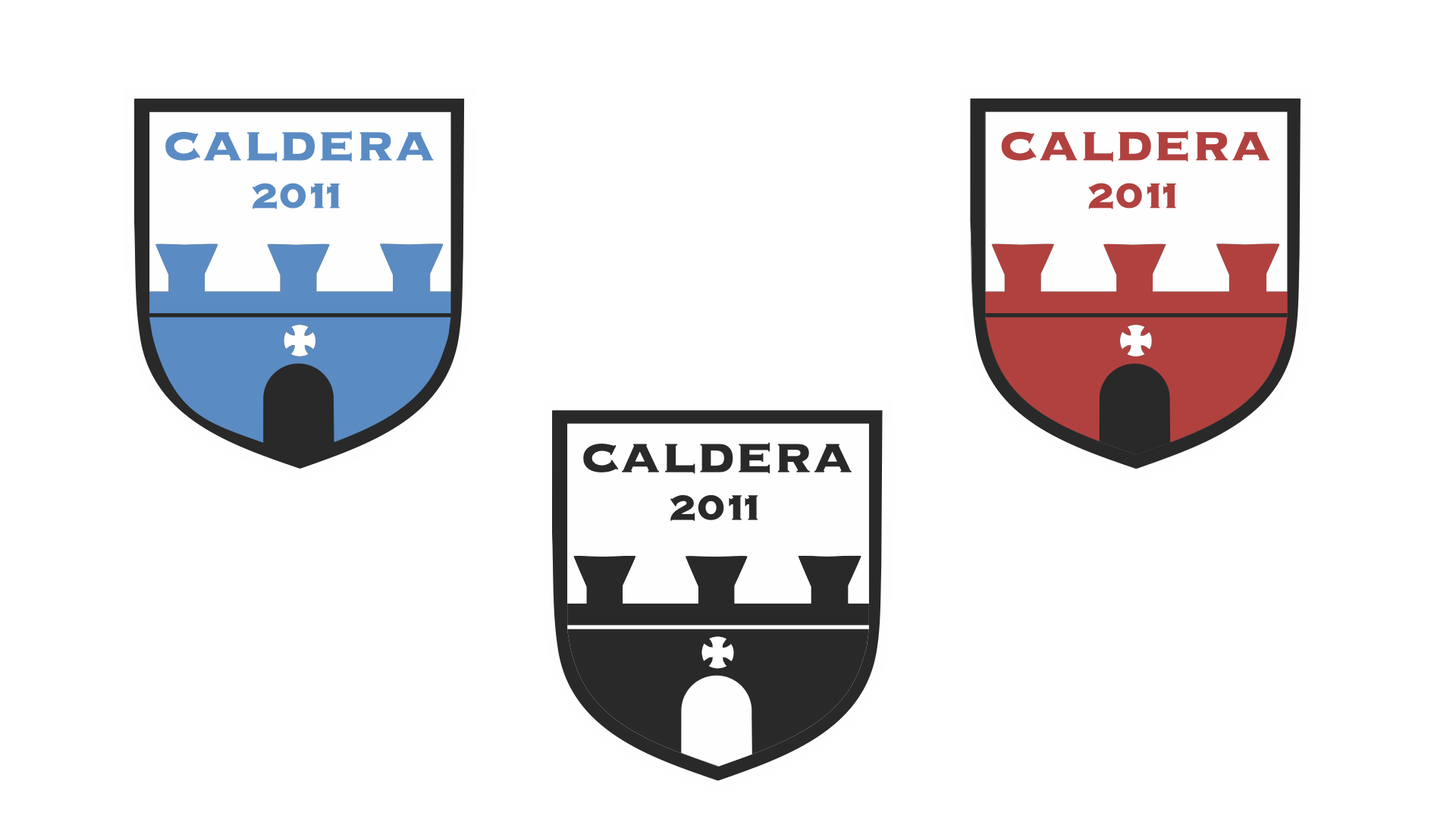
My team was Caldera F.C., a men’s and women’s football club based on São Miguel Island in the Azores, Portugal. The club was named after the island’s volcanic calderas — a powerful symbol of passion, pressure, and explosive talent that shaped the team’s identity.
Founded in 2011, Caldera F.C. was a young but ambitious club that quickly gained attention for its fearless playing style and strong presence on and off the pitch. Its ethos, “Pressure makes fire,” captured the spirit of both the island and the team — a belief that greatness is forged in intensity and heat.
Caldera wasn’t just a football club — it was a movement, fuelled by raw energy and a relentless drive to rise.


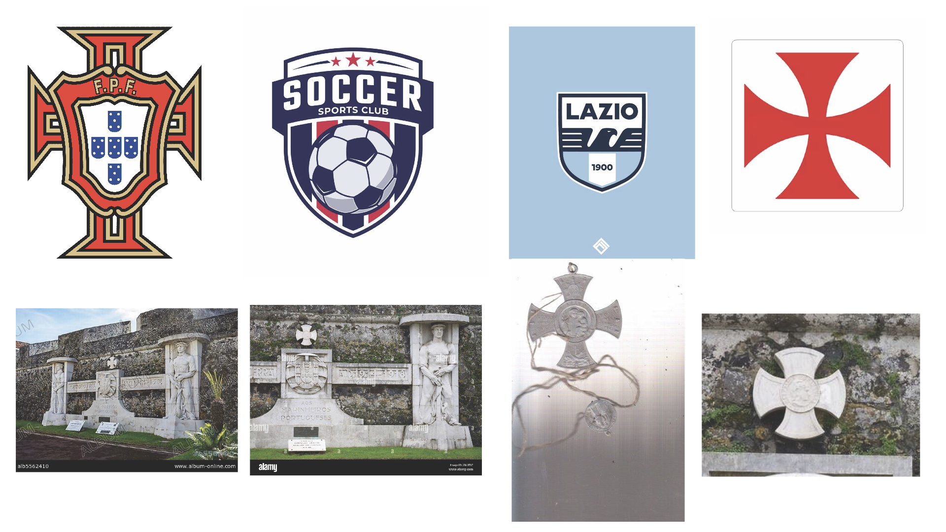
We were first put into teams of two and had to research visuals and style that might fit the project. We looked into the idea of using a volcano but quickly dropped this as the volcano on the island hasn’t erupted in thousands of years and it felt disconnected from the history of the island. We then research visual elements from the island such as the defense wall surrounding it or the religious elements present accross the island from the local religious (the Cult of the Lord Holy Christ of the Miracles) that would reflect its history better.
Experimentation
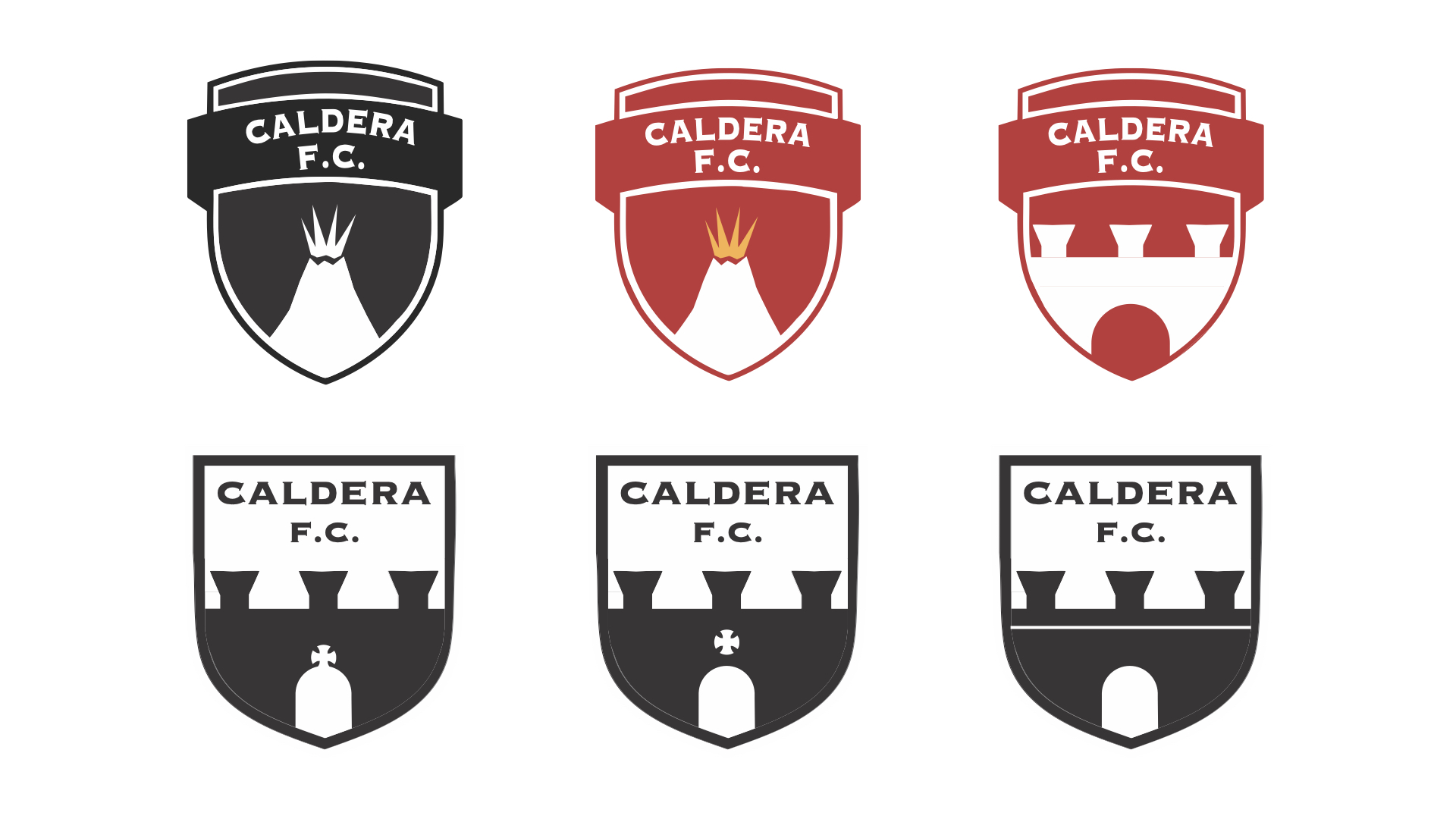
After some experimentation I ended up with a logo that used a series of elements from the island and its history such as the defense wall and the cross from the local religion but also the colours representing fire to remind of the volcano and the club’s ethos.
Final Outcome